Thursday 1 December 2011

Self portraits....take ages to get right!

We were asked to bring in a photo of ourselves for self portraits.
I havent done a self portrait since I was 17, its a lot easier to draw other people!

When it came to drawing myself, I found it very difficult I had to restart three times before I was even happy with a starting point.

My final outcome took me about an hour and a half maybe a bit more as i finished it at home.

Im pretty pleased with it although I can see that the proportions are not quite right.

Illustration cafe 30/11/11

An array of different toys, all arranged with our best friend Shelly the Skeleton.
I really enjoyed this session, sometimes its just nice to do some observational drawings :)

Wednesday 30 November 2011

Christmas time...Christmas cards

 After discovering flock and foil and how fun and easy it was I wanted to make some christmas cards.

Here are my designs which have been closely cut  and will be mounted onto festive paper and then cards.

Fun, easy, cheap and a lot more personal than any old Hallmark card.

Merry christmas!

A view from my window ~ images for Lino and dry point

I wish i'd taken some more interesting photo's, however my street is pretty boring so that would have been difficult.

Our cats have ideas of grandeur and fame and wouldn't leave me alone so they appeared in a few of my pictures.

After a discussion with Maria about the fireside book I either left the kitties out or made them more stylised.


This was a sketch for my Lino design, I ended up removing this pesky kitty from my final lino cut.

Lino cut and ready to print.
Lino print in blue, I like the simplicity of this print, although I wish I had thought about the colours and maybe worked into it more.

This is the drypoint print, if I were to do it again I would use less extender with the ink to give it a darker print, although this works well also.

Second design for lino cutting.

After my first lino cut, I wanted to try double or triple colours, it proved tricky trying to figure out which bits were going to stay certain colours and which bits to cut out next etc.. overall I like the outcome but would like to try some different colours next time.


Ghost Labels ~ Romance is dead

These are my initial sketches which led up to my finished label, unfortunately I didn't get a chance to scan my actual label so will have to update it with a picture later on :) but you'll get the gist.
Initial sketch and idea, the gentleman Romance.


This was my actual stencil, as you can see covered in spray paint....took ages to dry!


More of a 'ghostly' effect, using spray paint and black card.


Friday 4 November 2011

Found this TED talk and just had to share it :)

Ursus Wehrli 'Tidies up art'

Shiny fuzzy pretty things..Flock and Foil!

One of the most recent workshops that I attended was flock and Foil in the print room, I really enjoyed every aspect of the workshop and wanted my design to be one that would take full advantage of the finer details that can be achieved with this process.

My design was influenced by my jewellery box, which was passed down to me from my mum.

The box that influenced my design.

I didn't want my design to be a direct copy, so I took aspects of the box and composed my own design.

I think it worked really well with both Flock and Foil.


Flock can be applied to both paper and fabric as well as a number of other different materials.


Foils can also be applied to both paper and fabric, the shiny surface adds an extra contrast to the colour of both paper and foil.


These are some images that were produced using metallic inks, I found they were a bit messier as the ink is very runny and not as easy to control.

Overall this is an excellent medium that i'm definitely going to use again, the detail that can be achieved is very fine and also has the added extra of being tactile and soft to the touch.

Thursday 3 November 2011

Screenprint results!

screen printing went really well, it was one of the best things i've done so far this year and i'll definitely be doing it again.
One thing I learnt the hard way though is that if there is writing on your acetate, make sure its put the right way up in the exposure unit otherwise the result ends up being backwards... as you can see from my results.. Ooops!


These are a few different colour combinations that I tried, my favourite is the mixed colour image at the top, I think the colours work really well together.

Monday 17 October 2011

Top Trumps!

Woo Hoo! Everybody loves top trumps, even more so when they have awesome illustrators on them.
Here's mine..

Some may have noticed a reccuring theme on my blog.. Yes I LOVE Ben Templesmith (not in wierd stalker way) just because his artwork has inspired me to try digital illustration, so if he keeps on popping up on here then I apologise, however the more people that know about him the better.

Farewell for now!


Two Blogs that everyone must see!

Ben Templesmith.
One of my favourite artists, Ben Templesmith hails from Australia and illustrates graphic novels.
His artwork is very recognisable, with dark images and a great use of colour.
I love his blog as it comes across as being honest and open with his fans, he will answer most questions that are presented to him and has no problem sharing his techniques and tools that he uses to create his artwork.

His use of light within a dark and gloomy background really helps to create a macabre atmosphere whilst also making his style very distinctive.

http://www.bentemplesmith.blogspot.com/


James Jean.

American artist that I discovered after starting a new graphic novel series called 'Fables', James Jean created the individual covers for the series and his illustrations are absolutely beautiful, very delicate strokes and an almost dreamlike quality to the work.

Soft light and pastel colour palettes are indicative of his work, although he tends to reflect in his illustrations the theme of the story that will follow. The series itself is a portrayal of characters from old fairy tales that have been ousted from 'The homelands' and forced to move to our world, residing in a part of New York city known as 'Fabletown'


I found his website quite uninformative, however he has a massive index of his work which I was more than happy to browse through for a few hours!
http://www.jamesjean.com/

Thursday 13 October 2011

Lets have a look THROUGH the keyhole..

My house is VERY boring..literally, its grey, has white windows, a door and some bins outside...no garden to speak of, apart from the strawberries we planted earlier this year in a standing pot and a small selection of herbs in the back yard.
So, how to make the front of my house interesting so as to screen-print a good image later on?

Cover it in biscuits! My boyfriend has rules for biscuits.. he'll only eat them if they illiterate (yep definitely strange) for example: Custard Creams, Bourbon Biscuits, Wagon Wheels, Malted Milk... you get the idea.

A selection of biscuits and sweets, Liquorice Allsorts, Bourbons, Custard Creams, Chocolate Digestives, Nice and Pink wafers.
Mmm tasty!

Tuesday 11 October 2011

Skills, stuff and things...

I'm not overly familiar with Adobe Photoshop or Illustrator, however having had a project last year that I forced myself to use both programmes for, I am getting to grips with it more and more and i'm determined to make the most of it.
My main goal for the duration of my course is to become comfortable and fluent with both programmes as this is what I would like to use in most of my work.

My love of digital imagery comes from a number of illustrators whom I think take the medium to a completely different level.

Dave Mckean uses mostly photoshop and it is very apparent that he has used digital manipulation in his work.

Although his work is easily recognizable, he employs different techniques depending on his target audience.
For example his collaborative work with the author Neil Gaiman is generally aimed towards children, he has done a number of titles including : 'The day i swapped my dad for two goldfish', 'The wolves in the walls' and 'Crazy hair'.
He has however, also produced work for mature readers, graphic novels, teen fiction and even cookery books.
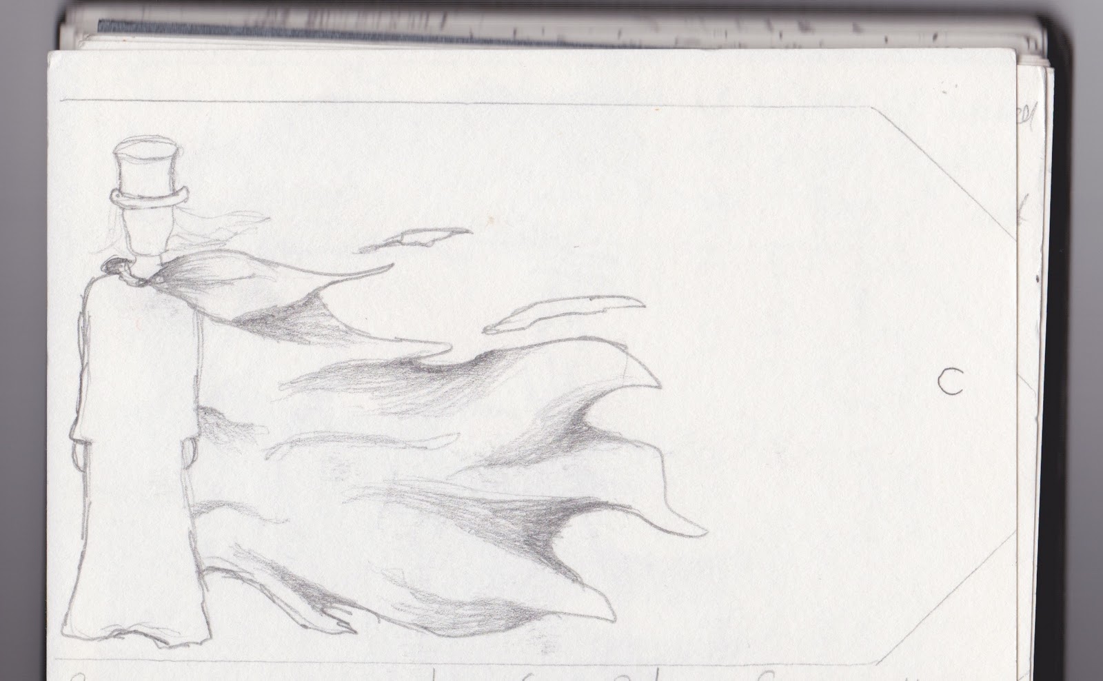
Here are some examples of his work.

'The day I swapped my dad for two goldfish'


Original drawing for Front cover before being altered digitally.
This image was taken from 'Squink' By Dave Mckean
Blatent use of Photography within this image.
Taken from 'The day I swapped my dad for two goldfish'

A more mature feel to his illustrations, with lots of text and more defined lines and a mix of techniques assorted on the page.
This image was taken from the graphic novel 'Pictures that tick' by Dave Mckean

Wednesday 5 October 2011

First venture into Photoshop and Illustrator

2010 Year 0

For our final project in Year 0 we were asked to write our own brief.
I decided to try a story without words, addressing the issue of Reading levels and dyslexia in children and young adults.

To do this I took an already published poem and tried to interpret it via images alone.
I also wanted to give myself a bit of a challenge and as I hadn't used Photoshop or Illustrator much, I used these programmes to work into my images.

Here are two images that I feel worked quite well.