Monday, 17 October 2011

Top Trumps!

Woo Hoo! Everybody loves top trumps, even more so when they have awesome illustrators on them.
Here's mine..

Some may have noticed a reccuring theme on my blog.. Yes I LOVE Ben Templesmith (not in wierd stalker way) just because his artwork has inspired me to try digital illustration, so if he keeps on popping up on here then I apologise, however the more people that know about him the better.

Farewell for now!


Two Blogs that everyone must see!

Ben Templesmith.
One of my favourite artists, Ben Templesmith hails from Australia and illustrates graphic novels.
His artwork is very recognisable, with dark images and a great use of colour.
I love his blog as it comes across as being honest and open with his fans, he will answer most questions that are presented to him and has no problem sharing his techniques and tools that he uses to create his artwork.

His use of light within a dark and gloomy background really helps to create a macabre atmosphere whilst also making his style very distinctive.

http://www.bentemplesmith.blogspot.com/


James Jean.

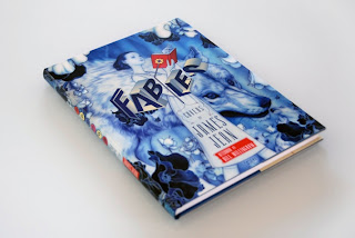
American artist that I discovered after starting a new graphic novel series called 'Fables', James Jean created the individual covers for the series and his illustrations are absolutely beautiful, very delicate strokes and an almost dreamlike quality to the work.

Soft light and pastel colour palettes are indicative of his work, although he tends to reflect in his illustrations the theme of the story that will follow. The series itself is a portrayal of characters from old fairy tales that have been ousted from 'The homelands' and forced to move to our world, residing in a part of New York city known as 'Fabletown'


I found his website quite uninformative, however he has a massive index of his work which I was more than happy to browse through for a few hours!
http://www.jamesjean.com/

Thursday, 13 October 2011

Lets have a look THROUGH the keyhole..

My house is VERY boring..literally, its grey, has white windows, a door and some bins outside...no garden to speak of, apart from the strawberries we planted earlier this year in a standing pot and a small selection of herbs in the back yard.
So, how to make the front of my house interesting so as to screen-print a good image later on?

Cover it in biscuits! My boyfriend has rules for biscuits.. he'll only eat them if they illiterate (yep definitely strange) for example: Custard Creams, Bourbon Biscuits, Wagon Wheels, Malted Milk... you get the idea.

A selection of biscuits and sweets, Liquorice Allsorts, Bourbons, Custard Creams, Chocolate Digestives, Nice and Pink wafers.
Mmm tasty!

Tuesday, 11 October 2011

Skills, stuff and things...

I'm not overly familiar with Adobe Photoshop or Illustrator, however having had a project last year that I forced myself to use both programmes for, I am getting to grips with it more and more and i'm determined to make the most of it.
My main goal for the duration of my course is to become comfortable and fluent with both programmes as this is what I would like to use in most of my work.

My love of digital imagery comes from a number of illustrators whom I think take the medium to a completely different level.

Dave Mckean uses mostly photoshop and it is very apparent that he has used digital manipulation in his work.

Although his work is easily recognizable, he employs different techniques depending on his target audience.
For example his collaborative work with the author Neil Gaiman is generally aimed towards children, he has done a number of titles including : 'The day i swapped my dad for two goldfish', 'The wolves in the walls' and 'Crazy hair'.
He has however, also produced work for mature readers, graphic novels, teen fiction and even cookery books.
Here are some examples of his work.

'The day I swapped my dad for two goldfish'


Original drawing for Front cover before being altered digitally.
This image was taken from 'Squink' By Dave Mckean
Blatent use of Photography within this image.
Taken from 'The day I swapped my dad for two goldfish'

A more mature feel to his illustrations, with lots of text and more defined lines and a mix of techniques assorted on the page.
This image was taken from the graphic novel 'Pictures that tick' by Dave Mckean

Wednesday, 5 October 2011

First venture into Photoshop and Illustrator

2010 Year 0

For our final project in Year 0 we were asked to write our own brief.
I decided to try a story without words, addressing the issue of Reading levels and dyslexia in children and young adults.

To do this I took an already published poem and tried to interpret it via images alone.
I also wanted to give myself a bit of a challenge and as I hadn't used Photoshop or Illustrator much, I used these programmes to work into my images.

Here are two images that I feel worked quite well.