After discovering flock and foil and how fun and easy it was I wanted to make some christmas cards.
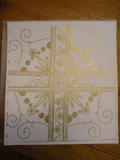
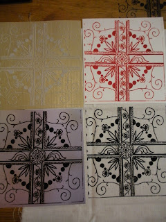
Here are my designs which have been closely cut and will be mounted onto festive paper and then cards.
Fun, easy, cheap and a lot more personal than any old Hallmark card.
Merry christmas!
Wednesday, 30 November 2011
A view from my window ~ images for Lino and dry point
I wish i'd taken some more interesting photo's, however my street is pretty boring so that would have been difficult.
Our cats have ideas of grandeur and fame and wouldn't leave me alone so they appeared in a few of my pictures.
After a discussion with Maria about the fireside book I either left the kitties out or made them more stylised.
Our cats have ideas of grandeur and fame and wouldn't leave me alone so they appeared in a few of my pictures.
After a discussion with Maria about the fireside book I either left the kitties out or made them more stylised.
 |
| This was a sketch for my Lino design, I ended up removing this pesky kitty from my final lino cut. |
 |
| Lino cut and ready to print. |
 |
| Lino print in blue, I like the simplicity of this print, although I wish I had thought about the colours and maybe worked into it more. |
 |
| This is the drypoint print, if I were to do it again I would use less extender with the ink to give it a darker print, although this works well also. |
 |
| Second design for lino cutting. |
Ghost Labels ~ Romance is dead
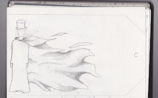
These are my initial sketches which led up to my finished label, unfortunately I didn't get a chance to scan my actual label so will have to update it with a picture later on :) but you'll get the gist.
 |
| Initial sketch and idea, the gentleman Romance. |
 |
| This was my actual stencil, as you can see covered in spray paint....took ages to dry! |
 |
| More of a 'ghostly' effect, using spray paint and black card. |
Friday, 4 November 2011
Shiny fuzzy pretty things..Flock and Foil!
One of the most recent workshops that I attended was flock and Foil in the print room, I really enjoyed every aspect of the workshop and wanted my design to be one that would take full advantage of the finer details that can be achieved with this process.
My design was influenced by my jewellery box, which was passed down to me from my mum.
I didn't want my design to be a direct copy, so I took aspects of the box and composed my own design.
I think it worked really well with both Flock and Foil.
Overall this is an excellent medium that i'm definitely going to use again, the detail that can be achieved is very fine and also has the added extra of being tactile and soft to the touch.
My design was influenced by my jewellery box, which was passed down to me from my mum.
 |
| The box that influenced my design. |
I didn't want my design to be a direct copy, so I took aspects of the box and composed my own design.
I think it worked really well with both Flock and Foil.
 |
| Flock can be applied to both paper and fabric as well as a number of other different materials. |
 |
| Foils can also be applied to both paper and fabric, the shiny surface adds an extra contrast to the colour of both paper and foil. |
 |
| These are some images that were produced using metallic inks, I found they were a bit messier as the ink is very runny and not as easy to control. |
Overall this is an excellent medium that i'm definitely going to use again, the detail that can be achieved is very fine and also has the added extra of being tactile and soft to the touch.
Thursday, 3 November 2011
Screenprint results!
screen printing went really well, it was one of the best things i've done so far this year and i'll definitely be doing it again.
One thing I learnt the hard way though is that if there is writing on your acetate, make sure its put the right way up in the exposure unit otherwise the result ends up being backwards... as you can see from my results.. Ooops!
These are a few different colour combinations that I tried, my favourite is the mixed colour image at the top, I think the colours work really well together.
Subscribe to:
Comments (Atom)


